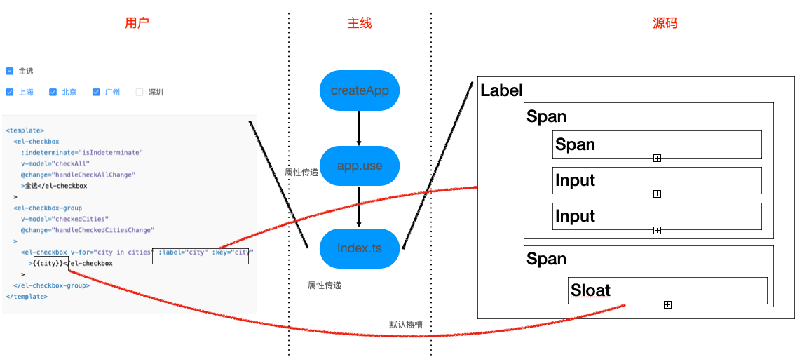
二.Checkbox
- 组件介绍Checkbox 多选框
index.ts
js
import Checkbox from './src/checkbox.vue'
import CheckboxButton from './src/checkbox-button.vue'
import CheckboxGroup from './src/checkbox-group.vue'

import type { App } from 'vue'
import type { SFCWithInstall } from '@element-plus/utils/types'

Checkbox.install = (app: App): void => {
  app.component(Checkbox.name, Checkbox)
  app.component(CheckboxButton.name, CheckboxButton)
  app.component(CheckboxGroup.name, CheckboxGroup)
}

Checkbox.CheckboxButton = CheckboxButton
Checkbox.CheckboxGroup = CheckboxGroup

const _Checkbox = Checkbox as any as SFCWithInstall<typeof Checkbox> & {
  CheckboxButton: typeof CheckboxButton
  CheckboxGroup: typeof CheckboxGroup
}

export default _Checkbox
export const ElCheckbox = _Checkbox
export const ElCheckboxButton = CheckboxButton
export const ElCheckboxGroup = CheckboxGroupsrc
checkbox.vue
vue
<template>
  <label
    :id="id"
    class="el-checkbox"
    :class="[
      checkboxSize ? 'el-checkbox--' + checkboxSize : '',
      { 'is-disabled': isDisabled },
      { 'is-bordered': border },
      { 'is-checked': isChecked },
    ]"
    :aria-controls="indeterminate ? controls : null"
  >
    <span
      class="el-checkbox__input"
      :class="{
        'is-disabled': isDisabled,
        'is-checked': isChecked,
        'is-indeterminate': indeterminate,
        'is-focus': focus,
      }"
      :tabindex="indeterminate ? 0 : undefined"
      :role="indeterminate ? 'checkbox' : undefined"
      :aria-checked="indeterminate ? 'mixed' : false"
    >
      <span class="el-checkbox__inner"></span>
      <input
        v-if="trueLabel || falseLabel"
        v-model="model"
        class="el-checkbox__original"
        type="checkbox"
        :aria-hidden="indeterminate ? 'true' : 'false'"
        :name="name"
        :disabled="isDisabled"
        :true-value="trueLabel"
        :false-value="falseLabel"
        @change="handleChange"
        @focus="focus = true"
        @blur="focus = false"
      />
      <input
        v-else
        v-model="model"
        class="el-checkbox__original"
        type="checkbox"
        :aria-hidden="indeterminate ? 'true' : 'false'"
        :disabled="isDisabled"
        :value="label"
        :name="name"
        @change="handleChange"
        @focus="focus = true"
        @blur="focus = false"
      />
    </span>
    <span v-if="$slots.default || label" class="el-checkbox__label">
      <slot></slot>
      <template v-if="!$slots.default">{{ label }}</template>
    </span>
  </label>
</template>
<script lang="ts">
import { defineComponent } from 'vue'
import { UPDATE_MODEL_EVENT } from '@element-plus/utils/constants'
import { isValidComponentSize } from '@element-plus/utils/validators'
import { useCheckbox } from './useCheckbox'

import type { PropType } from 'vue'
import type { ComponentSize } from '@element-plus/utils/types'

export default defineComponent({
  name: 'ElCheckbox',
  props: {
    modelValue: {
      type: [Boolean, Number, String],
      default: () => undefined,
    },
    label: {
      type: [String, Boolean, Number, Object],
    },
    indeterminate: Boolean,
    disabled: Boolean,
    checked: Boolean,
    name: {
      type: String,
      default: undefined,
    },
    trueLabel: {
      type: [String, Number],
      default: undefined,
    },
    falseLabel: {
      type: [String, Number],
      default: undefined,
    },
    id: {
      type: String,
      default: undefined,
    },
    controls: {
      type: String,
      default: undefined,
    },
    border: Boolean,
    size: {
      type: String as PropType<ComponentSize>,
      validator: isValidComponentSize,
    },
  },
  emits: [UPDATE_MODEL_EVENT, 'change'],
  setup(props) {
    return useCheckbox(props)
  },
})
</script>checkbox-button.vue
vue
<template>
  <label
    class="el-checkbox-button"
    :class="[
      size ? 'el-checkbox-button--' + size : '',
      { 'is-disabled': isDisabled },
      { 'is-checked': isChecked },
      { 'is-focus': focus },
    ]"
    role="checkbox"
    :aria-checked="isChecked"
    :aria-disabled="isDisabled"
  >
    <input
      v-if="trueLabel || falseLabel"
      v-model="model"
      class="el-checkbox-button__original"
      type="checkbox"
      :name="name"
      :disabled="isDisabled"
      :true-value="trueLabel"
      :false-value="falseLabel"
      @change="handleChange"
      @focus="focus = true"
      @blur="focus = false"
    />
    <input
      v-else
      v-model="model"
      class="el-checkbox-button__original"
      type="checkbox"
      :name="name"
      :disabled="isDisabled"
      :value="label"
      @change="handleChange"
      @focus="focus = true"
      @blur="focus = false"
    />

    <span
      v-if="$slots.default || label"
      class="el-checkbox-button__inner"
      :style="isChecked ? activeStyle : null"
    >
      <slot>{{ label }}</slot>
    </span>
  </label>
</template>
<script lang="ts">
import { defineComponent, computed } from 'vue'
import { UPDATE_MODEL_EVENT } from '@element-plus/utils/constants'
import { useCheckbox, useCheckboxGroup, useCheckboxProps } from './useCheckbox'

export default defineComponent({
  name: 'ElCheckboxButton',
  props: useCheckboxProps,
  emits: [UPDATE_MODEL_EVENT, 'change'],
  setup(props) {
    const { focus, isChecked, isDisabled, size, model, handleChange } =
      useCheckbox(props)
    const { checkboxGroup } = useCheckboxGroup()

    const activeStyle = computed(() => {
      const fillValue = checkboxGroup?.fill?.value ?? ''
      return {
        backgroundColor: fillValue,
        borderColor: fillValue,
        color: checkboxGroup?.textColor?.value ?? '',
        boxShadow: fillValue ? `-1px 0 0 0 ${fillValue}` : null,
      }
    })

    return {
      focus,
      isChecked,
      isDisabled,
      model,
      handleChange,
      activeStyle,
      size,
    }
  },
})
</script>checkbox-group.vue
vue
<template>
  <div class="el-checkbox-group" role="group" aria-label="checkbox-group">
    <slot></slot>
  </div>
</template>

<script lang="ts">
import {
  defineComponent,
  computed,
  watch,
  provide,
  nextTick,
  toRefs,
} from 'vue'
import { UPDATE_MODEL_EVENT } from '@element-plus/utils/constants'
import { isValidComponentSize } from '@element-plus/utils/validators'
import { useCheckboxGroup } from './useCheckbox'

import type { PropType } from 'vue'
import type { ComponentSize } from '@element-plus/utils/types'

export default defineComponent({
  name: 'ElCheckboxGroup',

  props: {
    modelValue: {
      type: [Object, Boolean, Array],
      default: () => undefined,
    },
    disabled: Boolean,
    min: {
      type: Number,
      default: undefined,
    },
    max: {
      type: Number,
      default: undefined,
    },
    size: {
      type: String as PropType<ComponentSize>,
      validator: isValidComponentSize,
    },
    fill: {
      type: String,
      default: undefined,
    },
    textColor: {
      type: String,
      default: undefined,
    },
  },

  emits: [UPDATE_MODEL_EVENT, 'change'],

  setup(props, ctx) {
    const { elFormItem, elFormItemSize, ELEMENT } = useCheckboxGroup()
    const checkboxGroupSize = computed(
      () => props.size || elFormItemSize.value || ELEMENT.size
    )

    const changeEvent = (value) => {
      ctx.emit(UPDATE_MODEL_EVENT, value)
      nextTick(() => {
        ctx.emit('change', value)
      })
    }

    const modelValue = computed({
      get() {
        return props.modelValue
      },
      set(val) {
        changeEvent(val)
      },
    })

    provide('CheckboxGroup', {
      name: 'ElCheckboxGroup',
      modelValue,
      ...toRefs(props),
      checkboxGroupSize,
      changeEvent,
    })

    watch(
      () => props.modelValue,
      (val) => {
        elFormItem.formItemMitt?.emit('el.form.change', [val])
      }
    )
  },
})
</script>checkbox.type.ts
js
import { ComputedRef } from 'vue'
import { AnyFunction } from '@element-plus/utils/types'
export interface ICheckboxGroupInstance {
  name?: string
  modelValue?: ComputedRef
  disabled?: ComputedRef<boolean>
  min?: ComputedRef<string | number>
  max?: ComputedRef<string | number>
  size?: ComputedRef<string>
  fill?: ComputedRef<string>
  textColor?: ComputedRef<string>
  checkboxGroupSize?: ComputedRef<string>
  changeEvent?: AnyFunction<any>
}useCheckbox.ts
js
import { ref, computed, inject, getCurrentInstance, watch } from 'vue'
import { toTypeString } from '@vue/shared'
import { UPDATE_MODEL_EVENT } from '@element-plus/utils/constants'
import { useGlobalConfig } from '@element-plus/utils/util'
import { elFormKey, elFormItemKey } from '@element-plus/tokens'

import type { ExtractPropTypes } from 'vue'
import type { ElFormContext, ElFormItemContext } from '@element-plus/tokens'
import type { PartialReturnType } from '@element-plus/utils/types'
import type { ICheckboxGroupInstance } from './checkbox.type'

export const useCheckboxProps = {
  modelValue: {
    type: [Boolean, Number, String],
    default: () => undefined,
  },
  label: {
    type: [String, Boolean, Number, Object],
  },
  indeterminate: Boolean,
  disabled: Boolean,
  checked: Boolean,
  name: {
    type: String,
    default: undefined,
  },
  trueLabel: {
    type: [String, Number],
    default: undefined,
  },
  falseLabel: {
    type: [String, Number],
    default: undefined,
  },
  size: String,
}

export type IUseCheckboxProps = ExtractPropTypes<typeof useCheckboxProps>

export const useCheckboxGroup = () => {
  const ELEMENT = useGlobalConfig()
  const elForm = inject(elFormKey, {} as ElFormContext)
  const elFormItem = inject(elFormItemKey, {} as ElFormItemContext)
  const checkboxGroup = inject<ICheckboxGroupInstance>('CheckboxGroup', {})
  const isGroup = computed(
    () => checkboxGroup && checkboxGroup?.name === 'ElCheckboxGroup'
  )
  const elFormItemSize = computed(() => {
    return elFormItem.size
  })
  return {
    isGroup,
    checkboxGroup,
    elForm,
    ELEMENT,
    elFormItemSize,
    elFormItem,
  }
}

const useModel = (props: IUseCheckboxProps) => {
  const selfModel = ref(false)
  const { emit } = getCurrentInstance()
  const { isGroup, checkboxGroup } = useCheckboxGroup()
  const isLimitExceeded = ref(false)
  const store = computed(() =>
    checkboxGroup ? checkboxGroup.modelValue?.value : props.modelValue
  )
  const model = computed({
    get() {
      return isGroup.value ? store.value : props.modelValue ?? selfModel.value
    },

    set(val: unknown) {
      if (isGroup.value && Array.isArray(val)) {
        isLimitExceeded.value = false

        if (
          checkboxGroup.min !== undefined &&
          val.length < checkboxGroup.min.value
        ) {
          isLimitExceeded.value = true
        }
        if (
          checkboxGroup.max !== undefined &&
          val.length > checkboxGroup.max.value
        ) {
          isLimitExceeded.value = true
        }

        isLimitExceeded.value === false && checkboxGroup?.changeEvent?.(val)
      } else {
        emit(UPDATE_MODEL_EVENT, val)
        selfModel.value = val as boolean
      }
    },
  })

  return {
    model,
    isLimitExceeded,
  }
}

const useCheckboxStatus = (
  props: IUseCheckboxProps,
  { model }: PartialReturnType<typeof useModel>
) => {
  const { isGroup, checkboxGroup, elFormItemSize, ELEMENT } = useCheckboxGroup()
  const focus = ref(false)
  const size = computed<string | undefined>(
    () =>
      checkboxGroup?.checkboxGroupSize?.value ||
      elFormItemSize.value ||
      ELEMENT.size
  )
  const isChecked = computed<boolean>(() => {
    const value = model.value
    if (toTypeString(value) === '[object Boolean]') {
      return value
    } else if (Array.isArray(value)) {
      return value.includes(props.label)
    } else if (value !== null && value !== undefined) {
      return value === props.trueLabel
    } else {
      return !!value
    }
  })
  const checkboxSize = computed(() => {
    const temCheckboxSize = props.size || elFormItemSize.value || ELEMENT.size
    return isGroup.value
      ? checkboxGroup?.checkboxGroupSize?.value || temCheckboxSize
      : temCheckboxSize
  })

  return {
    isChecked,
    focus,
    size,
    checkboxSize,
  }
}

const useDisabled = (
  props: IUseCheckboxProps,
  {
    model,
    isChecked,
  }: PartialReturnType<typeof useModel> &
    PartialReturnType<typeof useCheckboxStatus>
) => {
  const { elForm, isGroup, checkboxGroup } = useCheckboxGroup()
  const isLimitDisabled = computed(() => {
    const max = checkboxGroup.max?.value
    const min = checkboxGroup.min?.value
    return (
      (!!(max || min) && model.value.length >= max && !isChecked.value) ||
      (model.value.length <= min && isChecked.value)
    )
  })
  const isDisabled = computed(() => {
    const disabled = props.disabled || elForm.disabled
    return isGroup.value
      ? checkboxGroup.disabled?.value || disabled || isLimitDisabled.value
      : props.disabled || elForm.disabled
  })

  return {
    isDisabled,
    isLimitDisabled,
  }
}

const setStoreValue = (
  props: IUseCheckboxProps,
  { model }: PartialReturnType<typeof useModel>
) => {
  function addToStore() {
    if (Array.isArray(model.value) && !model.value.includes(props.label)) {
      model.value.push(props.label)
    } else {
      model.value = props.trueLabel || true
    }
  }
  props.checked && addToStore()
}

const useEvent = (
  props: IUseCheckboxProps,
  { isLimitExceeded }: PartialReturnType<typeof useModel>
) => {
  const { elFormItem } = useCheckboxGroup()
  const { emit } = getCurrentInstance()
  function handleChange(e: InputEvent) {
    if (isLimitExceeded.value) return
    const target = e.target as HTMLInputElement
    const value = target.checked
      ? props.trueLabel ?? true
      : props.falseLabel ?? false

    emit('change', value, e)
  }

  watch(
    () => props.modelValue,
    (val) => {
      elFormItem.formItemMitt?.emit('el.form.change', [val])
    }
  )

  return {
    handleChange,
  }
}

export const useCheckbox = (props: IUseCheckboxProps) => {
  const { model, isLimitExceeded } = useModel(props)
  const { focus, size, isChecked, checkboxSize } = useCheckboxStatus(props, {
    model,
  })
  const { isDisabled } = useDisabled(props, { model, isChecked })
  const { handleChange } = useEvent(props, { isLimitExceeded })

  setStoreValue(props, { model })

  return {
    isChecked,
    isDisabled,
    checkboxSize,
    model,
    handleChange,
    focus,
    size,
  }
}